




Times extended: 2
Learners per cohort: 128
Deals won: 4
Squared Online

The online digital marketing course developed with Google

Client:
Google · Avado
Role:
UX/UI Designer
Audience:
Marketers of tomorrow
Duration:
Two years
Year:
2014 – 2016
Client:
Google · Avado
Role:
UX/UI Designer
Audience:
Marketers of tomorrow
Duration:
Two years
Year:
2014 – 2016

Virtual Learning Campus

Google and Avado designed the course. I designed the product.

Non-interactive demo of the Squared Online course: a student opens Module Two from the dashboard, reviews the week's syllabus, joins the last live class, follows the live chat and completes the module.

Happy-path flow of a student opening Module Two, joining the live class and completing it

The problem

Avado ran all of its courses on Moodle, a learning management system which had all the components we needed: courses, modules, live classes, exams and chat all came as standard. What didn't come as standard was the UX/UI and design system that we needed. Google and the team at Avado developed the course content and syllabus together, but out of the box the UI was bare and off-brand.

Squared Online needed to look, feel and behave like a true Google product. The answer was taking the designed course and then following Google's Material Design Guidelines and core UX principles from my own experience to create a fully-functioning service that was unmistakably part of Google's ecosystem.

Meet the team

Forks in the road

Two decisions shaped the campus: one about what to build on, one about how learning should feel.

  1. Build on Moodle, look like Google

    Challenge

    An LMS with everything except a face

    • Courses, exams, enrolment and chat all came built in
    • The stock UI was bare, off-brand and unmistakably Moodle
    • A ground-up build meant re-solving solved problems
    Back on track

    Keep the machinery, redesign the experience

    • Themed Moodle's components into Material Design
    • Every screen mapped to a capability that already worked
    • A Google-grade product shipped on LMS timescales
  2. From grid to journey

    Challenge

    A grid of modules told students nothing

    • All five modules presented at once, equal weight
    • No sense of where you were or what came next
    • Progress lived inside modules, invisible from the dashboard
    Back on track

    The modules became a sequence

    • One current module front and centre, ringed with progress
    • Completed modules behind you, locked ones ahead
    • Students always knew: where they were, and how far to next

Trade-offs

Working inside an LMS, and inside someone else's brand, meant accepting constraints on purpose.

  1. Moodle data model took priority

    Challenge

    The LMS decided how the course would be structured

    • Modules, activities and exams followed Moodle's data model
    • Interactions couldn't stray far from what it could render
    • Anything custom meant extra dev work
    Accepted

    Constrain the model, not the UI

    • Design effort went to the moments students actually feel
    • Assessment, enrolment and chat worked from day one
    • I had little say as to the course experience, mostly the UX/UI for the front end
  2. Material, not bespoke

    Challenge

    Google's brand without Google's design team

    • The product had to read as Google at first glance
    • No component library existed for the course itself
    • I had to be very precise to match Google's design system
    Accepted

    Material Design gave me a solid foundation

    • Cards, progress rings and sticky menus straight from the guidelines
    • Bright module colours carried Google's own identity
    • Familiarity meant users already knew what to do

The module quiz

Five quick questions that close a module without breaking its flow.

Non-interactive demo of the Module Four quiz: a student answers five questions across five different controls, passes with 4 out of 5, sees the wrong answer flagged and completes the module.

Happy-path flow of a student sitting the Module Four quiz, passing with 4 out of 5 and completing the module

The final exam

One attempt, five questions and the certificate the whole course builds towards.

Non-interactive demo of the final exam: a student answers five questions under a 45-minute clock, uploads a video presentation, submits past the one-chance confirmation, completes the course and opens their Merit result in Messages 14 days later.

Happy-path flow of a student sitting the final exam, submitting past the point of no return, completing the course and opening their result in Messages 14 days later

What didn't make the cut

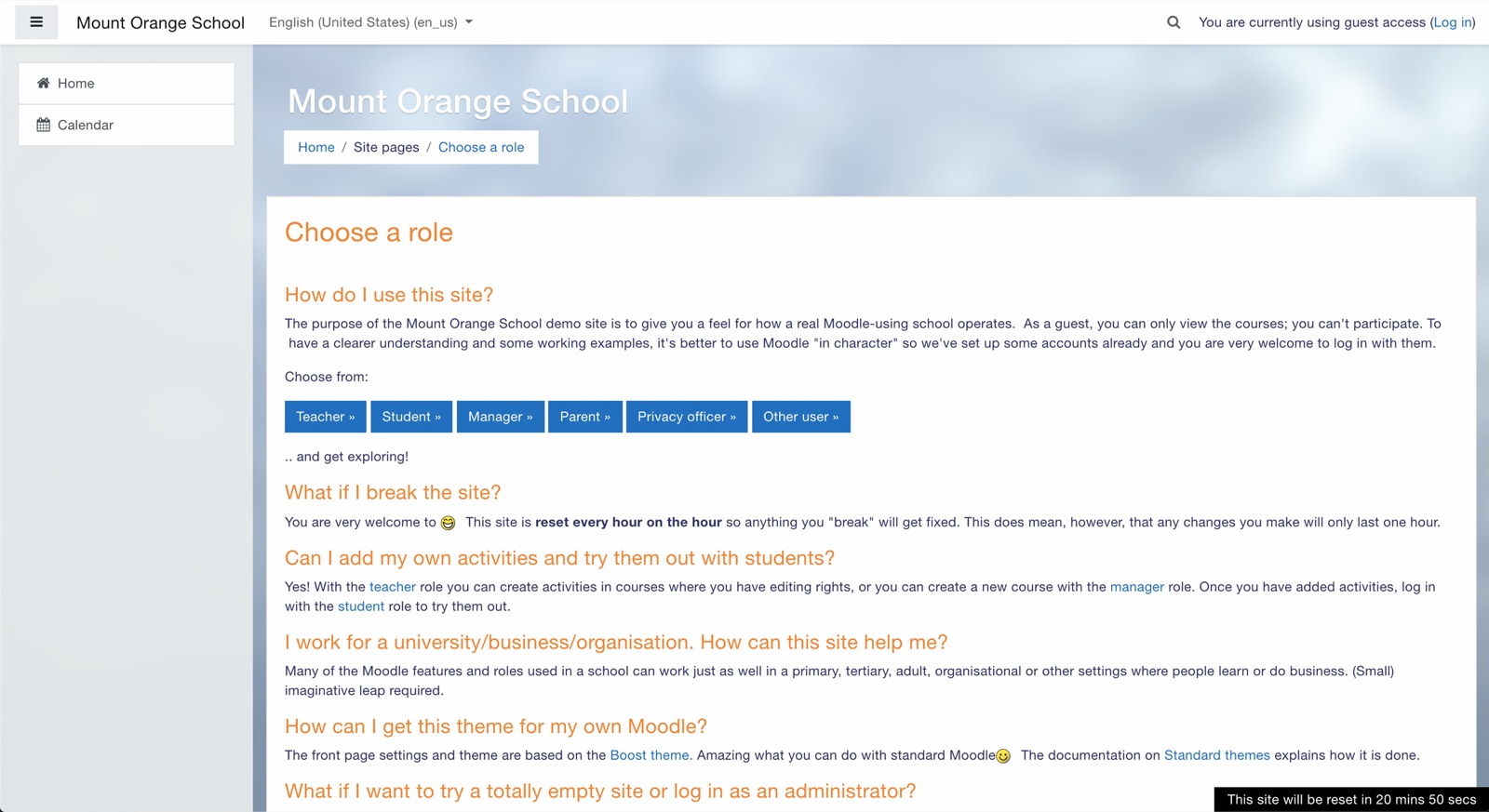
Moodle, out of the box

Squared Online needed to feel like a Google course, not a Moodle course. Which is why UX/UI and design systems were so important for this project to succeed.

Moodle's stock demo site, Mount Orange School: a plain LMS page with a grey sidebar, orange headings and a row of blue role buttons
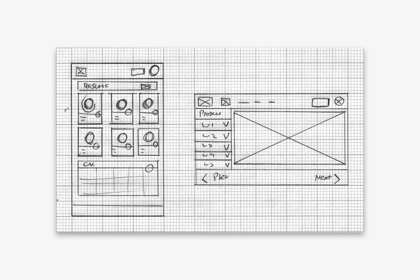
Pencil sketches on grid paper: a mobile dashboard with a grid of six module cards beside a desktop course layout with a week list and a content pane

What didn't make the cut

  • Moodle's stock demo site, Mount Orange School: a plain LMS page with a grey sidebar, orange headings and a row of blue role buttons

    Moodle, out of the box

    Base Moodle UI out of the box: the starting point that had to go

  • Pencil sketches on grid paper: a mobile dashboard with a grid of six module cards beside a desktop course layout with a week list and a content pane

    It starts with a sketch

    The initial sketch, with the module grid that didn't survive

Retro

Squared Online is the project that turned me from a graphic designer into a product designer, it's a miracle at the time that I got hired for such a high-profile job, but I guess they saw potential in me. It sent me down the rabbit hole of understanding how products came to be, how problems are solved at a user-centred level, and how all the research up front sets the foundations for the design work to follow in a project of this size.

If I were to do it all again, I'd have focussed more on what already existed in Google's suite of products over the Material Design library as it would have given me a more holistic view of how Squared Online could work, look and feel.

Next project

Glacier Drop

One of the largest token distributions in blockchain history

  • Tokens distributed: 4.5B
  • Wallets reached: 8M
  • Supported ecosystems: 8
View project