Demo wallets generated: 120K
Smart contracts initiated: 1M
Smart contracts built: 14K
Marlowe

Powerful smart contracts in the hands of the consumer

Client:
IOG
Role:
Senior Product Designer
Audience:
Token holders
Duration:
9 months
Year:
2024 – 2025
Client:
IOG
Role:
Senior Product Designer
Audience:
Token holders
Duration:
9 months
Year:
2024 – 2025

Marlowe Run

The first consumer app for running financial smart contracts on the Cardano blockchain

Non-interactive demo showing the Marlowe Run flow: creating a wallet, setting up an escrow contract with defined roles, and stepping through the running contract to completion.

Happy-path flow of a user generating a demo wallet, selecting a loan template, and two users successfully completing the loan

The problem

For most people, crypto does just three things: you buy it, you sell it, or you send it. The bigger promise of blockchain was always more than that. Two people could make a financial agreement that settles itself, with no bank in the middle. But that promise stayed locked behind developer tools and wallets that everyday users were never going to touch.

Marlowe Run set out to change that. The idea was simple. Let two ordinary people enter a real agreement, like a loan or an escrow, and have the smart contract hold the funds and enforce the terms on its own. No bank, no middleman, no code. The hard part was taking something genuinely complex and making it feel as simple and familiar as any app on your phone.

Meet the team

Russ Hepton Senior Product Designer

Forks in the road

Four moments Marlowe Run could have gone the wrong way. Each pivot pulled the work onto a better path for ordinary people making a real agreement.

  1. Wallet-first vs agreement-first

    Challenge

    The app opened on a wallet, not on the thing people came to do

    • First build led with balances and a connect-wallet wall
    • Users had to understand crypto before they could start an agreement
    • The "make a deal with someone" job was buried two screens deep
    Back on track

    Reframed around the agreement, not the wallet

    • Home leads with "start a contract", the wallet recedes
    • Demo wallet auto-generated so people can try before connecting
    • Crypto mechanics deferred to the moment they actually matter
  2. Blockchain language vs human language

    Challenge

    Early copy spoke in protocol terms, not human ones

    • Screens said "UTxO", "datum", "validator", "min-ADA"
    • Loan steps were named after contract states, not user intent
    • Testing showed people couldn't tell if they'd been paid
    Back on track

    A plain-English layer over the contract

    • Every state mapped to a human sentence ("Alex has repaid you")
    • Amounts in ADA with a fiat reference, fees explained inline
    • Status copy written from the user's view, not the chain's
  3. One generic flow vs role-aware journeys

    Challenge

    Lender and borrower were forced through the same screens

    • A single flow tried to serve both sides of the deal
    • Each person saw actions that weren't theirs to take
    • Confusion over "whose turn is it" stalled deals mid-flow
    Back on track

    Split the journey by role and turn

    • Each party sees only their next action
    • A clear "waiting on the other party" state for the off-turn side
    • Notifications nudge the right person at the right step
  4. Real funds vs a safe demo on-ramp

    Challenge

    New users had to risk real ADA to understand the product

    • The only way in was a funded mainnet wallet
    • High stakes for a first run of an unfamiliar concept
    • Drop-off before anyone reached the self-settling "aha"
    Back on track

    A demo wallet to learn the loop risk-free

    • One-tap demo wallet, pre-funded with test ADA
    • The full happy-path loan runs before real money is involved
    • The leap to a real wallet happens once trust is earned

Trade-offs

Not every problem had a clean fix. Four moments where the work meant choosing between two imperfect paths, and being honest about the cost.

  1. Template library vs free-form agreements

    Challenge

    People wanted any agreement, we could only safely ship a few

    • Open-ended contracts meant unbounded edge cases
    • Each new type multiplied states, copy and testing
    • No way to guarantee safety on contracts we hadn't seen
    Accepted

    Shipped a curated set of vetted templates

    • Launched with loan and escrow only, tested end to end
    • Closed off custom contracts despite clear demand
    • Roadmapped a template gallery instead of an open builder
  2. Honest fees vs a frictionless feel

    Challenge

    Network fees made a "free" agreement feel less clean

    • Every on-chain action carried an unavoidable ADA fee
    • Hiding it felt dishonest, showing it added friction
    • Min-ADA rules confused people expecting exact amounts
    Accepted

    Chose transparency over a frictionless illusion

    • Fees surfaced before each confirm, with a one-line "why"
    • A small buffer in balances so amounts never surprised
    • A slightly heavier flow, in exchange for trust
  3. On-chain speed vs the feeling of "done"

    Challenge

    Settlement isn't instant, but users expect app-speed

    • Confirmations take real time on the chain
    • A storyless spinner felt broken to app-trained users
    • "Did it work?" anxiety at the high-stakes moment
    Accepted

    Designed the wait instead of hiding it

    • Optimistic UI shows intent immediately, then confirms
    • Honest progress states narrate what the chain is doing
    • "Settled" lags "submitted", and we said so plainly
  4. Custodial convenience vs self-custody integrity

    Challenge

    Holding keys for users would have been far simpler

    • Self-custody puts seed phrases and recovery on the user
    • A custodial model would remove the scariest steps
    • But it betrays the whole point of a trustless agreement
    Accepted

    Kept self-custody, softened the edges

    • Stayed non-custodial despite the easier path
    • Invested in clearer key and recovery education in-flow
    • Higher onboarding effort, in exchange for real control

Marlowe Play

The cloud-based IDE where developers author, simulate, and ship Marlowe smart contracts

Non-interactive demo showing an escrow contract being authored across the Marlowe, Blockly and Flow editor views, then simulated step by step and published to the contract library.

Authoring an escrow contract in three views: Marlowe, Blockly and Flow, then simulating it as the consumer would see it

The problem

A smart contract is only as useful as the people who can build it. On Cardano, that meant specialist skills and a local toolchain just to get started. The gap between an idea and a working contract was a wall most people never got over.

Marlowe Play set out to lower it. It gave developers a browser-based IDE where they could author a financial contract, simulate it step by step to see exactly how it would behave, and publish it. Nothing to install, nothing to set up. Building on Cardano became something you could just open a tab and do.

Forks in the road

Four moments Marlowe Play could have gone the wrong way. Each pivot pulled the IDE onto a better path for the people meant to build on it.

  1. Code-first vs visual-first authoring

    Challenge

    The IDE assumed everyone wanted to write Marlowe by hand

    • The first cut centred a raw Marlowe code editor
    • Non-Haskell developers bounced off the syntax
    • The "anyone can build a contract" promise stayed theoretical
    Back on track

    Multiple linked views onto one contract

    • Added Blockly so logic is assembled, not typed
    • Code and blocks stay in sync, edit either side
    • Lowered the floor without lowering the ceiling
  2. Three views vs two that earn their place

    Challenge

    Marlowe, Blockly and Flow each competed for the canvas

    • A third "Flow" diagram sounded helpful on paper
    • In testing it duplicated Blockly without adding clarity
    • Three synced representations tripled the build cost
    Back on track

    Cut Flow, doubled down on Marlowe and Blockly

    • Dropped the Flow view before it shipped
    • Put the effort into two views that are genuinely reliable
    • A simpler model: read it, or build it
  3. Deploy-to-test vs simulate-in-place

    Challenge

    The only way to see behaviour was to deploy and watch

    • The early flow pushed contracts on-chain just to observe them
    • A slow, costly loop for something you repeat constantly
    • Mistakes only surfaced after real deployment
    Back on track

    A step-by-step simulator inside the IDE

    • Simulate the contract as the consumer would experience it
    • Step through deposits, choices and payouts before publishing
    • Catch logic errors in seconds, not on-chain
  4. Silent failure vs teaching errors

    Challenge

    Invalid contracts failed without saying why

    • A bad contract simply refused to run
    • Errors pointed at internals, not the line you wrote
    • Developers couldn't tell a typo from a logic flaw
    Back on track

    Errors and warnings that point at the cause

    • Syntax errors surfaced inline at the offending line
    • Warnings flag risky-but-valid choices before simulating
    • The simulator halts loudly and explains what broke

Trade-offs

Four moments where building the IDE meant choosing between two imperfect paths, and being honest about what the choice cost.

  1. Browser convenience vs local-toolchain power

    Challenge

    A cloud IDE can't match a full local dev setup

    • Serious devs expect their own editor, plugins and shell
    • The browser sandbox limits what we can offer
    • Heavy contracts strain an in-tab environment
    Accepted

    Optimised for the first contract, not the thousandth

    • Prioritised zero-setup onboarding over pro-grade depth
    • Accepted a ceiling on advanced local workflows
    • Bet that "open a tab and start" wins more people in
  2. Guardrails vs expressive freedom

    Challenge

    Safer contracts meant fewer ways to write them

    • Constraining the language prevents whole classes of bug
    • It also blocks clever, valid patterns devs might want
    • Marlowe's safety is both the point and the limitation
    Accepted

    Kept the guardrails, made them legible

    • Leaned into Marlowe's bounded, analysable design
    • Explained why a pattern isn't allowed, not just that it isn't
    • Less expressiveness, in exchange for provable safety
  3. One simulated path vs every possible path

    Challenge

    A contract branches more ways than anyone can click through

    • Simulating one journey proves it runs, not that it's correct
    • Walking every branch is overwhelming in a UI
    • False confidence if people test only the happy path
    Accepted

    Made the happy path easy, flagged the rest

    • Designed a fast, clear single-path simulation
    • Surfaced static-analysis warnings for unhandled cases
    • Full verification lives beyond the simulator, and we said so
  4. Polish vs shipping while the language moved

    Challenge

    Marlowe itself was still evolving under the IDE

    • Building UI on a spec that kept changing
    • Polish risked becoming rework on the next language shift
    • Waiting for stability meant shipping nothing
    Accepted

    Shipped against a moving target, kept it modular

    • Released early to learn from real authors
    • Kept views loosely coupled so language changes stayed contained
    • Ongoing churn, accepted as the cost of being first

What didn't make the cut

Video-led onboarding

The first splash tried to onboard people with a video, written explanations and blockchain terminology. It read like a product tour, not an invitation. In testing, people skipped straight past it: nobody played the video or touched the helper text, so we stripped the onboarding back to only what they actually used.
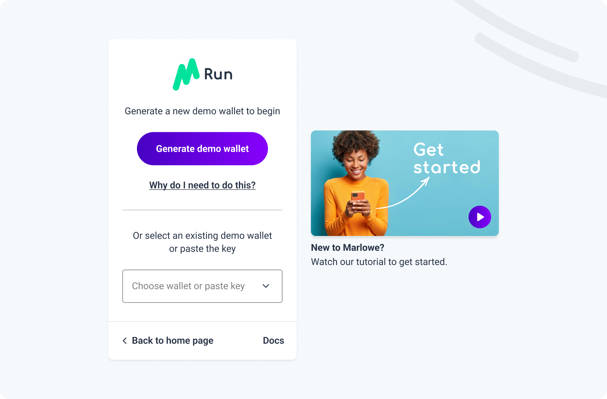
The original Marlowe Run splash page, built around an onboarding video and written explanations
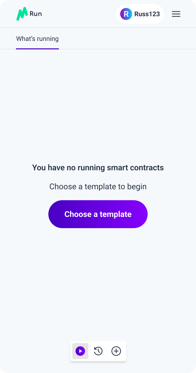
Early mobile dashboard with three icons in the bottom bar
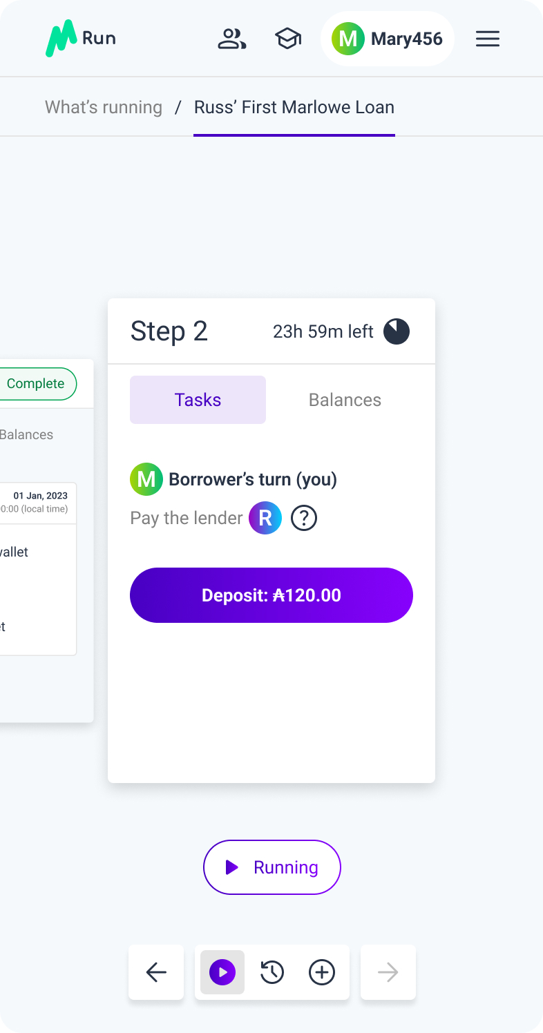
Early contract step-two card showing both roles' tasks at once
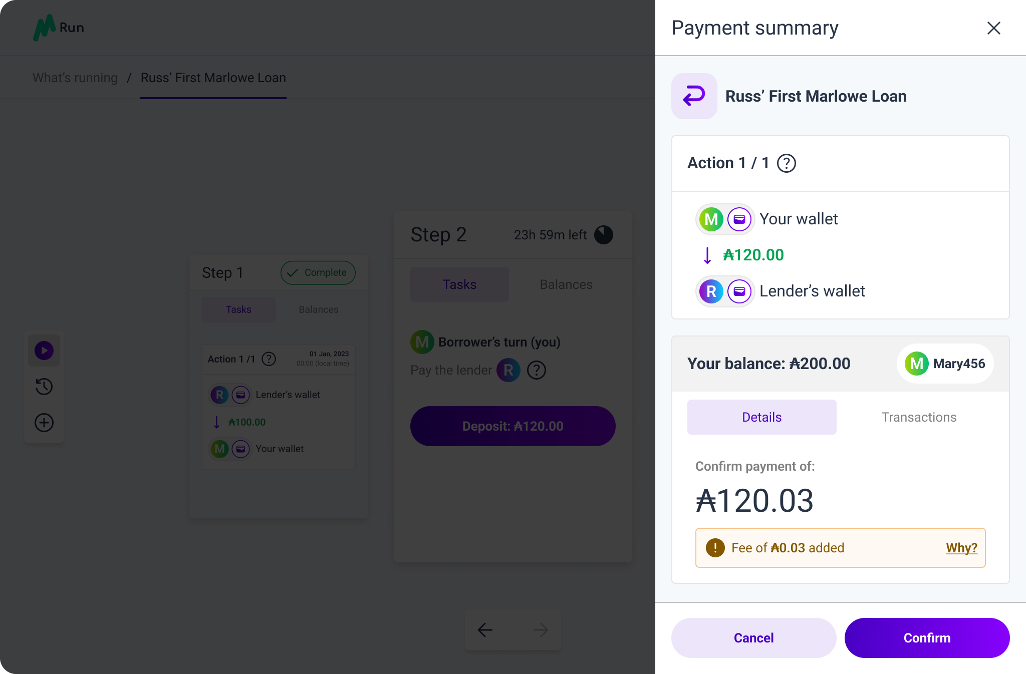
The payment summary as a right-hand drawer, dense with icons

What didn't make the cut

  • The original Marlowe Run splash page, built around an onboarding video and written explanations

    Video-led onboarding

    The first splash tried to onboard people with a video, written explanations and blockchain terminology. In testing they never played the video or touched the helper elements, so we stripped the onboarding back to what they actually used.

  • Early mobile dashboard with three icons in the bottom bar

    A three-icon dashboard

    An early dashboard used three icons in the bottom bar. People kept getting lost, so we moved every key tab into a single labelled menu rail along the bottom.

  • Early contract step-two card showing both roles' tasks at once

    Both roles, one card

    Early concepts cluttered the card. The status sat in a separate element that had become obsolete, and both role icons showed at once. We stripped it back to only what each person needed to see.

  • The payment summary as a right-hand drawer, dense with icons

    A payment drawer

    The payment summary first slid in as a right-hand drawer, dense with icons. It cluttered the UI and felt intrusive, so the final design used a calmer, centred modal instead.

Retro

I'd have got Marlowe Play in front of more external developers. We only had time to properly usability-test the Marlowe Run app, so the IDE leaned on feedback from the developers on my own team.

They were the primary audience for Marlowe Play, so it was a fair enough fallback. The catch is that they already knew the product inside out, which made them biased. A few sessions with developers meeting Marlowe for the first time would have told us far more about where the authoring experience really tripped people up.

Next project

Glacier Drop

One of the largest token distributions in blockchain history.

  • Tokens distributed: 4.5B
  • Wallets reached: 8M
  • Supported ecosystems: 8
View project