User errors: 40%
Timeline reduction: 30%
Time to decision: 3s
Mortgage Hub

Disrupting a 250-year-old industry

Client:
Target Group
Role:
Senior Product Designer
Audience:
Brokers and lenders
Duration:
9 months
Year:
2021 – 2022
Client:
Target Group
Role:
Senior Product Designer
Audience:
Brokers and lenders
Duration:
9 months
Year:
2021 – 2022

Decision in principle

Entering loan requirements and getting an instant lending decision

Non-interactive demo of the Mortgage Hub decision in principle flow: a broker signs in, opens a new case, corrects the applicant details and submits for an approved decision.

Happy-path flow of a broker managing their cases, correcting the applicant details and running the decision engine to an instant decision in principle

The problem

Mortgage Hub is Target Group's white-label mortgage origination service, giving brokers instant lending decisions via Open Banking, a decision engine and OCR under the hood. Origination is high-stakes, low-margin work: human errors cause issues and time to completion decides whether a case goes through.

I joined as the lead product designer as Mortgage Hub neared its first release, to nurture the design team and refine the design system, key templates and user journey. Most research was already done, so the job was proper usability testing, validating what did and didn't work, and ensuring consistency as we pivoted towards better solutions.

Meet the team

Forks in the road

Two moments that changed what we built. Both came from watching brokers use the thing rather than from a brief.

  1. Testing before touching

    Challenge

    Confidence in the build had never been checked

    • "I need warnings. Where to now?"
    • "I didn't know I had to go to fees first!"
    • "What do the green bars mean?"
    Back on track

    Usability studies bought us the evidence

    • Ran studies on the flows already built
    • Audits and design reviews made critique routine
    • Case navigation surfaced as the biggest pain point
  2. Case navigation

    Challenge

    Brokers lost their place inside a case

    • No sense of where they were or what came next
    • Required steps discovered only by failing them
    • Warnings arrived too late to act on
    Back on track

    Fixed it without a single new requirement

    • Solved inside the existing scope, no creep
    • Removed a lot of unnecessary development effort
    • Better experience and less to build at once

Trade-offs

Two choices where the honest option cost something. Both were shaped by joining a product that was already most of the way to release.

  1. Refine, don't rebuild

    Challenge

    The design system needed real work

    • Components and templates drifting apart
    • A full rebuild would have moved the release date
    Accepted

    Refined the system already in flight

    • Tightened typography, colour, buttons, alerts and inputs
    • Fixed the key templates the whole journey leans on
    • Left the deeper rebuild for a later team to take on
  2. Leading while delivering

    Challenge

    Hired for design and for the design team

    • Growing three designers while shipping the broker view
    • Mentoring and hiring competing with hands-on design time
    Accepted

    Made critique the thing that scaled

    • Regular design reviews, audits and usability studies
    • Quality held across three designers, not just my own work
    • Team efficiency up 25% over the contract

Open banking

Verifying income by inviting the customer to connect their bank

Non-interactive demo of an existing Mortgage Hub case: a broker reopens an incomplete case, connects the applicant's bank through open banking and submits for an approved decision in principle.

Happy-path flow of a broker reopening an incomplete case, connecting the applicant's account through Open Banking and resubmitting for a decision

Full mortgage application

Accepting fees, uploading documents and submitting the full application

Non-interactive demo of the Mortgage Hub full mortgage application: a broker accepts fees, submits the application, uploads the requested documents and the decision engine returns an approval.

Edge case flow of a broker uploading the requested documents to a referred application and submitting the full mortgage application to the lender

What didn't make the cut

The heavyweight sign in

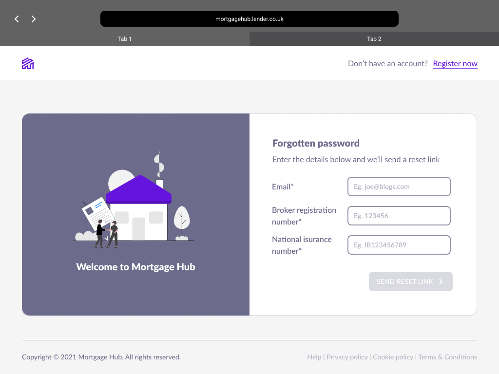
The early sign-in screens asked brokers to gather far too much. A password reset alone wanted an email address, a broker registration number and a National Insurance number before it would send a link. Every extra field meant hunting for paperwork, so the flow was cut to email, password and a one-time code.

An early Mortgage Hub forgotten-password screen asking for an email, a broker registration number and a National Insurance number, beside a large house illustration
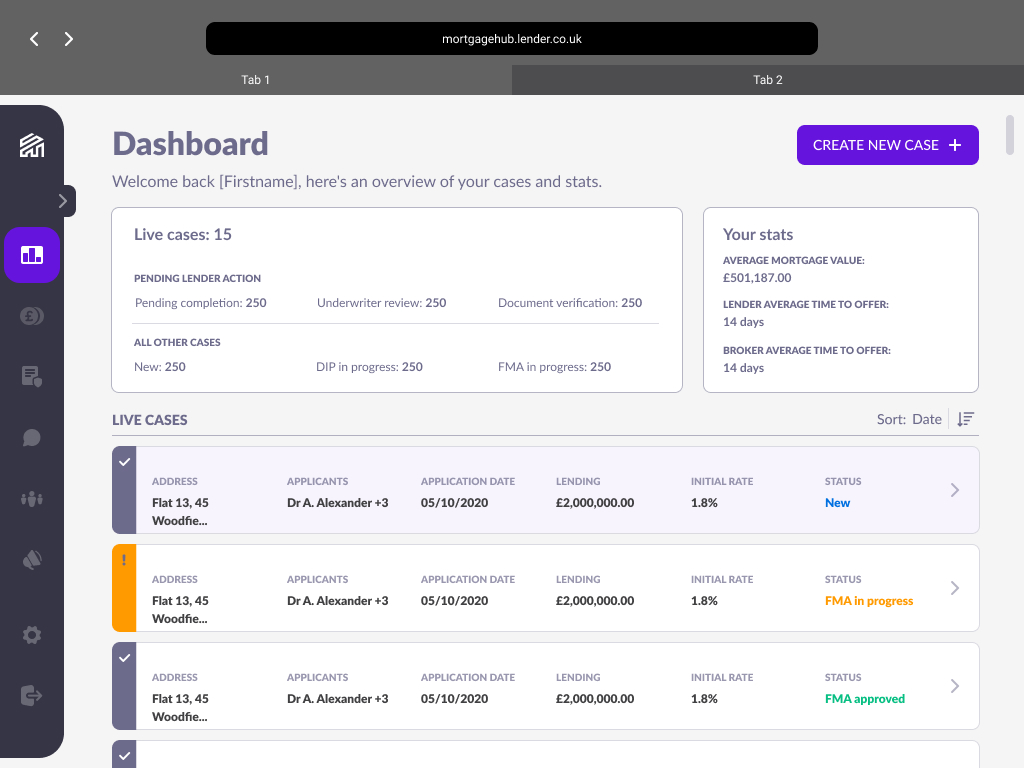
The old Mortgage Hub dashboard with live cases rendered as large card rows, each showing address, applicants, date, lending, rate and status
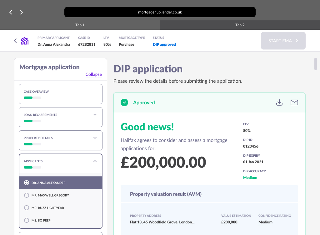
The old mortgage application side navigation, a single long list of sections with DIP and FMA mixed together and a progress bar on every section
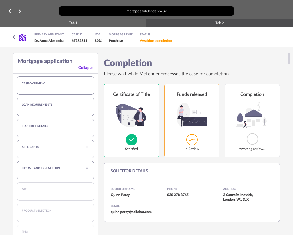
The old completion screen with three large illustrated status cards for certificate of title, funds released and completion

What didn't make the cut

  • An early Mortgage Hub forgotten-password screen asking for an email, a broker registration number and a National Insurance number, beside a large house illustration

    The heavyweight sign in

    An early forgotten-password screen asking for registration and National Insurance numbers just to send a reset link

  • The old Mortgage Hub dashboard with live cases rendered as large card rows, each showing address, applicants, date, lending, rate and status

    Cards posing as a table

    The old case list gave each case a card row of its own, with no way to filter or scan at density

  • The old mortgage application side navigation, a single long list of sections with DIP and FMA mixed together and a progress bar on every section

    One nav, two journeys

    The single application nav ran DIP and FMA into one long list and put a progress bar on everything

  • The old completion screen with three large illustrated status cards for certificate of title, funds released and completion

    Illustrations for the wrong audience

    Large-format completion illustrations built for a consumer audience, in a tool only brokers would ever see

Retro

I'd have stripped the component library back to only what was actually in use before amending its contents, rather than refining what was already there. Several components got amended and were later axed once user testing ran, effort a leaner library would never have spent. Starting from only what was live would have given the team far more room to build consistent page templates together.

Next project

Squared Online

The online digital marketing course developed with Google

  • Times extended: 2
  • Learners per cohort: 128
  • Deals won: 4
View project